
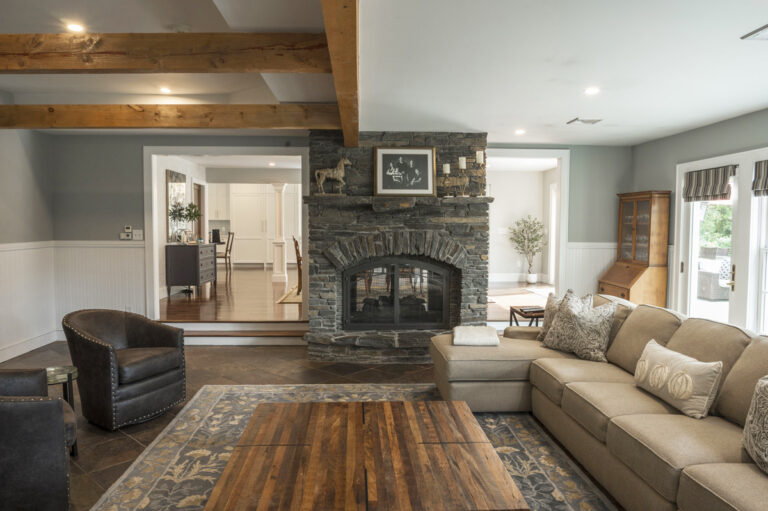
Scale and proportion are the unsung heroes of interior design, serving as the invisible lines that dictate whether or not a room feels effortlessly together, or completely chaotic.
It was a foundational concept hammered into me during my days at the Fashion Institute of Technology. We learned that design is never just about aesthetics—it’s a strict discipline of relationships. Decades later, those lesson plans still guide every single design decision I make in my career.
While people often use the terms “scale” and “proportion” interchangeably, they mean completely different things in practice.
Scale vs. Proportion: The Golden Rules
The easiest way to remember the difference is a rule of thumb I still carry from my FIT professors: Scale is how big an item is relative to the architecture or environment it’s in, while proportion is how items relate to each other.
- Scale (The Macro Relationship): This compares an object to the room itself or to the human form. If you drop a massive, deep-seated sectional into a tiny studio apartment, it is out of scale because it suffocates the room. Conversely, a petite accent chair in a grand living room with vaulted ceilings completely loses its impact.
- Proportion (The Micro Relationship): This examines the visual weight and balance between individual items. A classic rookie mistake is placing a tiny, delicate coffee table in front of a sprawling sofa. Even if the sofa perfectly fits the scale of the room, the proportion between the table and the sofa is fundamentally broken.
The Ultimate Reference Point: You
Why does a poorly scaled room feel so unsettling? Because, as people, we subconsciously measure everything against our own bodies. Interior environments are ultimately built for human utility and comfort.
Pro-Tips to Perfect the Balance
If you are struggling to make a room feel harmonized, keep these classic design principles in mind:
Measure and Plan the Biggest Pieces First:
- Always map out your largest items (like sofas or beds) on a digital floor plan or tape them out on the floor before purchasing.
- Ensure you maintain 36 to 48 inches of clearance for traffic flow around boundaries. (I cannot stress this enough!)
- When referring to furniture layouts, those clearance figures can be fewer. For example, the space between a coffee table and sofa can range from 15″ to 24″. There is some wiggle room, and always consider the size of the people using the space. Their comfort matters most.
Lean on the Golden Ratio:
Designers often use the mathematical Golden Ratio (1:1.618) to reduce guesswork. For example, aim for your coffee table to be roughly two-thirds the length of your sofa for a near-perfect visual proportion.
Vary Visual Weights:
A room where every single piece of furniture is low to the ground and bulky will feel incredibly heavy. For example, balance a dense sofa with leggier, lighter accent chairs, and draw the eye upward with a tall floor lamp or vertical artwork to balance out the height of the room.
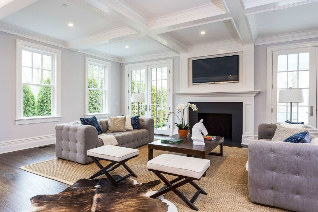
This room is an excellent example of these practices. Here are some things to note:
- The high windows and intricate ceiling fixtures are grounded by lower-to-the-ground furniture.
- The large, bulky sofas are balanced out with lighter accent chairs and lighting fixtures.
- The coffee table, sofas, and chairs are all sized appropriately for people to sit comfortably around them and chat, reach their drinks, etc.
Ask Yourself This
When designing a space, ask yourself these questions:
- Is this piece the appropriate size for the person using it? (This one is always first for me.)
- Is this piece the appropriate size for the overall room?
- Is this piece the appropriate size compared to the other items grouped with it?
These ideas are so important because the eye will view it together as a whole concept. Each item needs to play well with the others to create balance and harmony. It also allows your eyes a place to go, to follow around a room and a place to rest.
The Troubleshooting Guide: Fixing Common Layout Flops
When a room layout feels uncomfortable, it is almost always because the spatial boundaries or sightlines are choked. Here are some common issues I’ve observed:
- The Long “Bowling Alley” Living Room: The instinct here is to push all furniture against the long walls, which forces an uncomfortably wide, awkward gap in the center. Instead, divide the room into two distinct zones. Pull a main sofa away from the wall to anchor a primary conversation group on a large area rug, and use the remaining third of the room for a secondary function—like a petite reading nook or a compact office. [Text Wrapping Break]
- The “All Doorways” Traffic Jam: If a room has multiple entryways, floating the furniture centrally is your best defense. Keep furniture away from the walls entirely so that the perimeter serves as a continuous walkway, preserving a standard 36-inch clearance path.
- The Tiny, Low-Ceiling Box: Counterintuitively, putting lots of micro-furniture into a small room makes it look cluttered and highlights its limitations. Instead, use a few full-scaled foundational pieces to establish clear intent, and keep them low-slung to maximize the empty air—the negative space—above them.
Architectural Hacking
When we alter layout, and other elements like color and lighting, we are manipulating how the human brain calculates spatial volume. In design school, we called this architectural hacking—using visual cues to shift the perceived boundaries and weights of a room without moving a single wall.
Color As Structural Weight: Adjusting Spatial Boundaries
Color does heavy structural lifting in interior environments because its values and saturation levels trick our eyes into perceiving distance.
- Making Walls Recede or Advance: Light, cool colors (like pale blues, soft grays, and crisp whites) reflect the most light, causing boundaries to visually “recede” and making rooms feel much more spacious. Conversely, deep, dark, saturated tones absorb light and visually “advance” toward the viewer. Use a moody tone to break up a cavernous room and make it feel beautifully intimate.
- Manipulating Ceiling Height: If your ceiling feels claustrophobic, use a classic paint color trick: paint the ceiling a stark, bright white and the walls a slightly darker shade. The contrast draws your gaze up, creating a loftier illusion. If you have a vaulted ceiling that feels cold and ungrounded, paint it a rich, deep hue to lower the visual plane and bring the space back to a comforting human scale.
- The Infinite Box Trick: In highly restrictive or windowless layouts, painting the trim, baseboards, walls, and ceiling the exact same monochromatic color completely eliminates visual boundaries. Without stark edge lines to map out, your eyes cannot easily calculate where the walls end and the ceiling begins. AKA Color drenching.
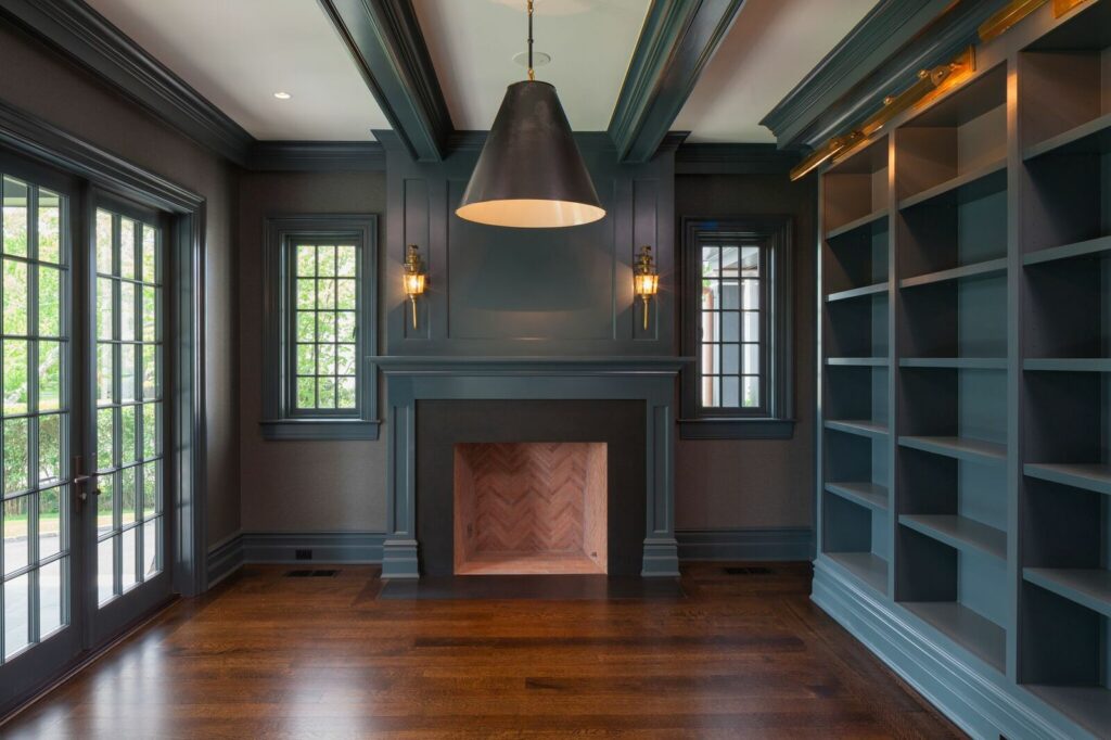
This space utilizes both color drenching and ceiling height manipulation.
Lighting Scale & Proportions: Creating Visual Planes
Even the most carefully calculated layout fails if the lighting is poor. A single, blazing overhead flush-mount light completely flattens a room’s dimension. To create depth, you must build visual volume with layers of light and shadow.
- The Chandelier Sizing Rule: Fixture scale is a common pitfall.
- To ensure your main hanging fixture matches the room’s scale, calculate a baseline guide by adding the room’s length and width in feet—convert that total number straight into inches to find an ideal fixture diameter. For instance, a 12-by-16-foot dining room perfectly welcomes a bold 28-inch chandelier. 12 ft + 16 ft = 28 inches. It is very common for people to undersize lighting; and this formula can eliminate that.
- The Three Layers of Contrast: To add depth, distribute your lighting across three distinct tiers:
- Ambient: General overhead lighting to set a comfortable base plane.
- Task: Focused desk, kitchen island, or reading lamps.
- Accent: Uplighting behind plants, art frames, or low bookcases.
- Controlling Room Proportions with Light Placement: To make a narrow room appear wider, place accent lighting or wall-washers exclusively along the shortest walls to pull focus outward. To make a low ceiling look soaring, skip down-facing table lamps and opt for vertical floor lamps or wall sconces that cast light upward, stretching the perceived height of your walls.
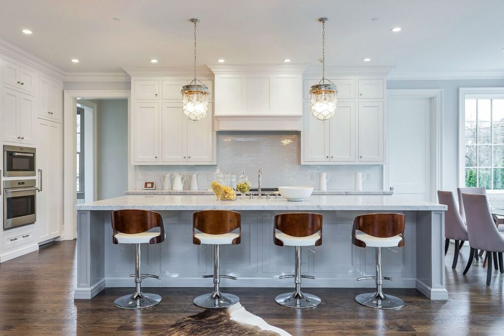
This kitchen is a great example of how lighting can influence the feel of a space. While the recessed lighting provides even illumination throughout the kitchen, the two sconces help define the island as a focal point, grounding it, and creating a more inviting place to gather.
Exaggerating Scale
To make a bold statement, designers often take creative liberties by exaggerating scale to draw the eye in.
Oversized headboards, large lighting fixtures, and extra-large artwork are all examples of intentionally playing with scale and proportion. These elements stand out precisely because they break expectations, creating visual interest.
In a room with otherwise restrained furnishings, a single oversized element can elevate the entire space, creating a strong focal point. A large mirror can make a room feel taller and wider, and an oversized piece of art can do the same. Purposeful exaggeration feels dramatic, not overwhelming, when driven by design intent.
Designing with a Trained Eye
Once you start viewing spaces through this lens, you will never look at a room the same way again. As I like to say, “I can’t unsee it”. But scale and proportion aren’t limits on your creativity; they are the guidelines that ensure your creativity actually shines.
Frequently Asked Questions
How do I choose the right size area rug for a room?
In a living room, I generally recommend choosing a rug large enough to accommodate at least the front legs of your main seating pieces. A rug that’s too small can make an otherwise well-proportioned room feel disconnected.
Can window treatments change the perceived size of a room?
Absolutely. Hanging curtain rods higher than the window frame can create the illusion of taller windows and higher ceilings. Extending the rod beyond the window’s width can also make windows appear larger. These small adjustments can dramatically change how we perceive the proportions of a space.
How does the scale of patterns affect interior design?
Pattern scale is just as important as furniture scale. For example, combining several bold, large-scale patterns can make a room feel overwhelming, while mixing larger patterns with smaller, more subtle designs creates visual balance. This applies to everything from wallpaper and upholstery to rugs and decorative tile.
Does tile size affect how large or small a bathroom feels?
Yes, although larger tiles aren’t necessarily better for every small bathroom. Large-format tiles typically create fewer grout lines, which can give a space a more continuous appearance. Smaller tiles introduce more visual detail and can be particularly effective in showers, niches, or as accents. The best choice depends on the room’s dimensions, architecture, and overall design.
How do scale and proportion apply to custom cabinetry and built-ins?
Custom cabinetry should feel like a natural extension of a room’s architecture. Ceiling height, window placement, existing trim, and the dimensions of surrounding furniture all influence how cabinets and built-ins should be proportioned. It’s also important to consider practical details, such as shelf heights, storage needs, and how comfortably someone can access the cabinetry.
